BluePrint Design Library
A design system created to enable consistent design patterns and improve team workflow.
Components
To ensure that all designs would be consistent with each other, each component had to be meticulously built exactly as they are represented in code.
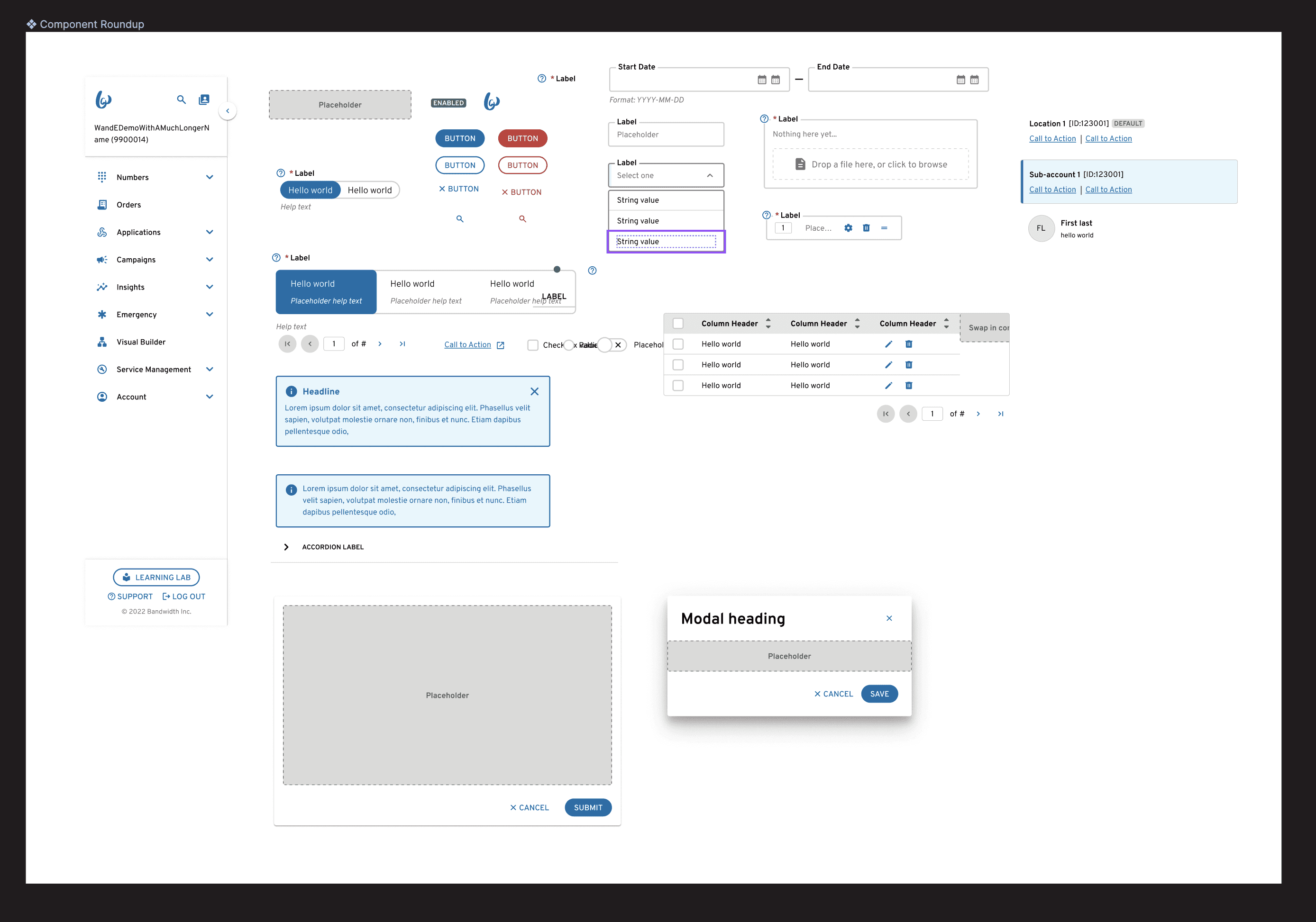
Creating components required implementing some complex figma prototyping to ensure components were as stylistically accurate as possible
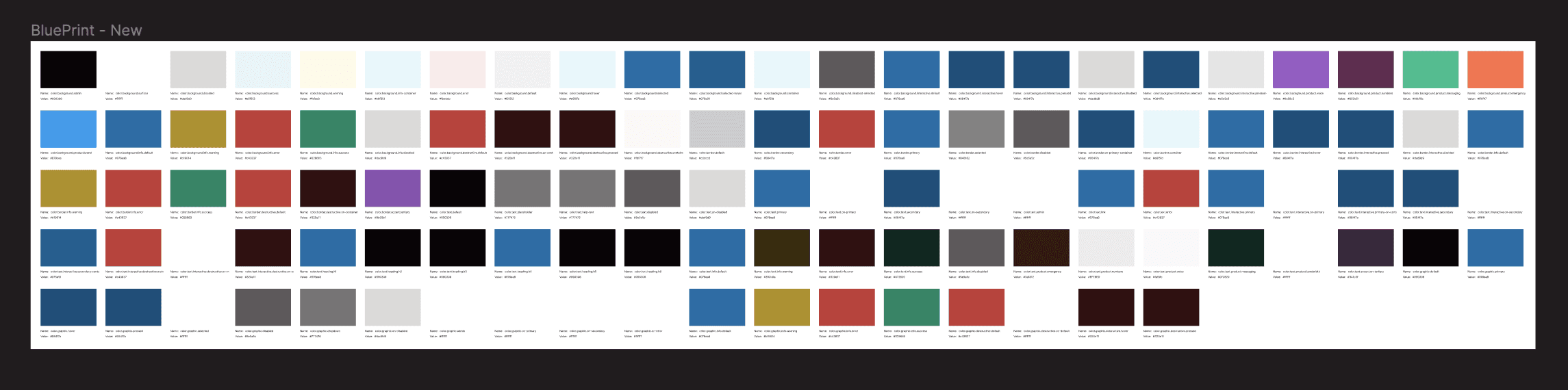
Tokens
BluePrint leverages a 3-tier token system that allows me to use a reference palette (left) to define a theme (middle) and use the theme to define component-level tokens (right).
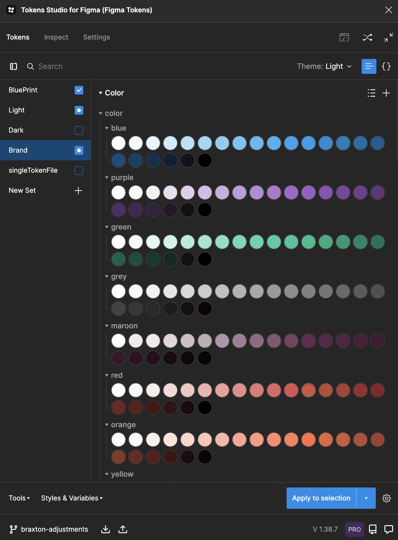
Reference tokens
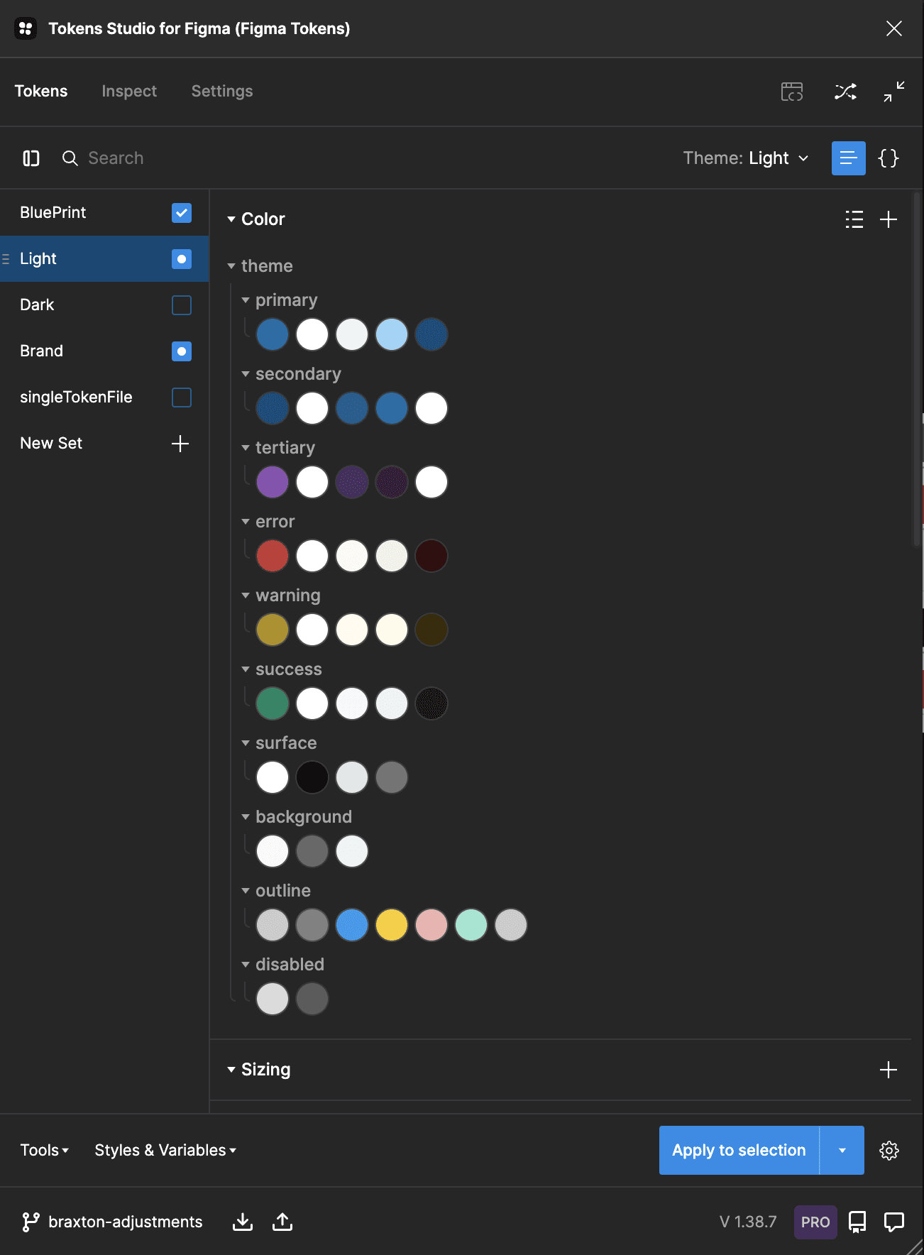
Theme tokens
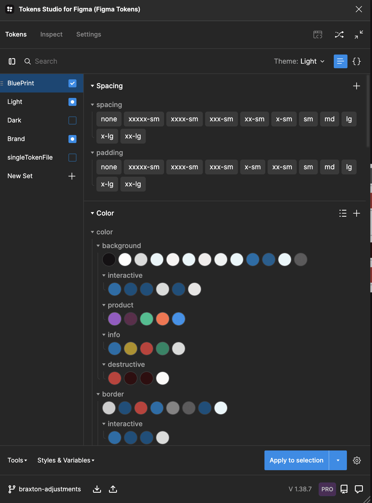
Component tokens
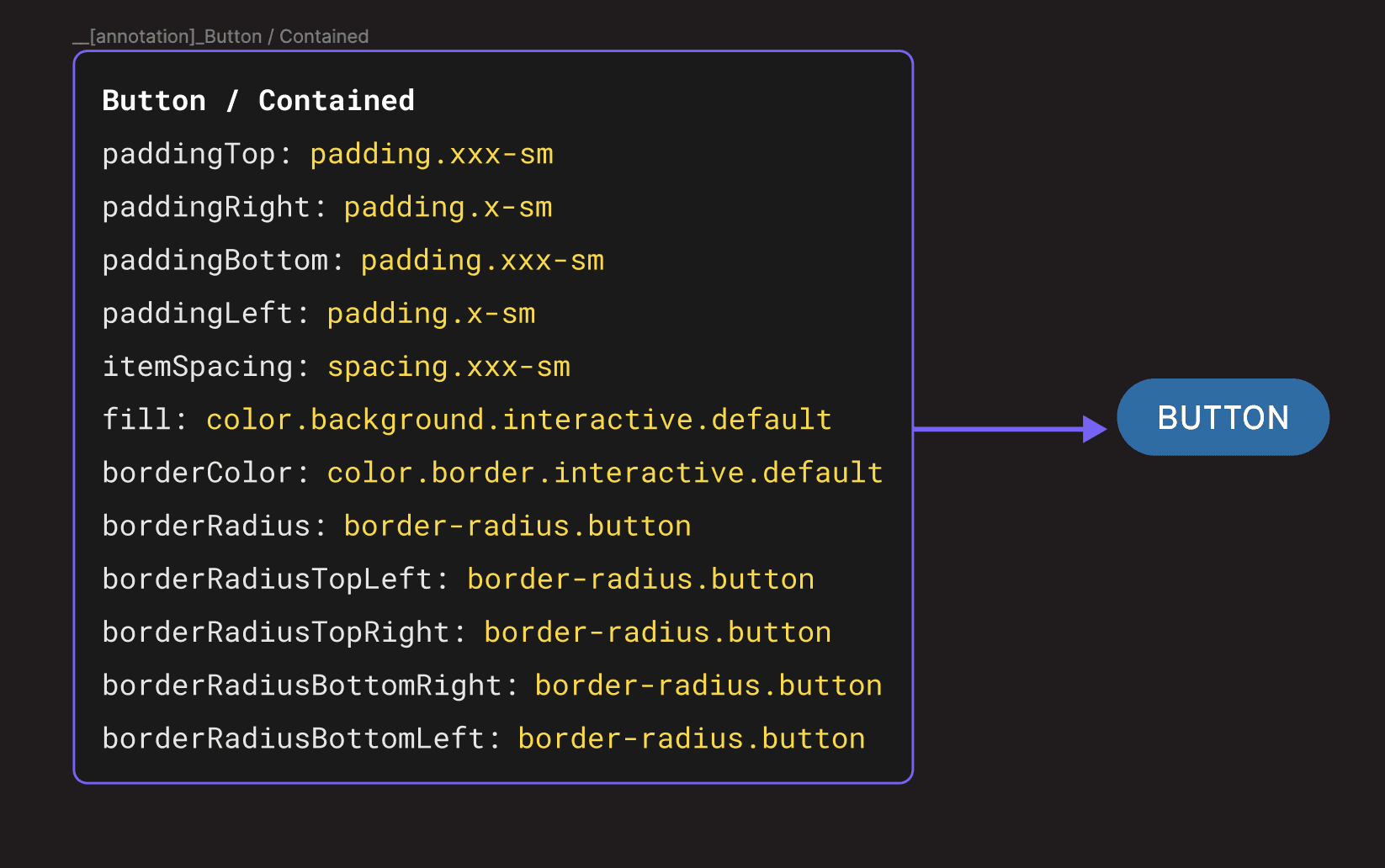
The 3 tier system allows me to change a color once, and that change populate down the tree to every component using that color.
A built-in token structure to easily adjust styles that sync across figma files as well as code repo
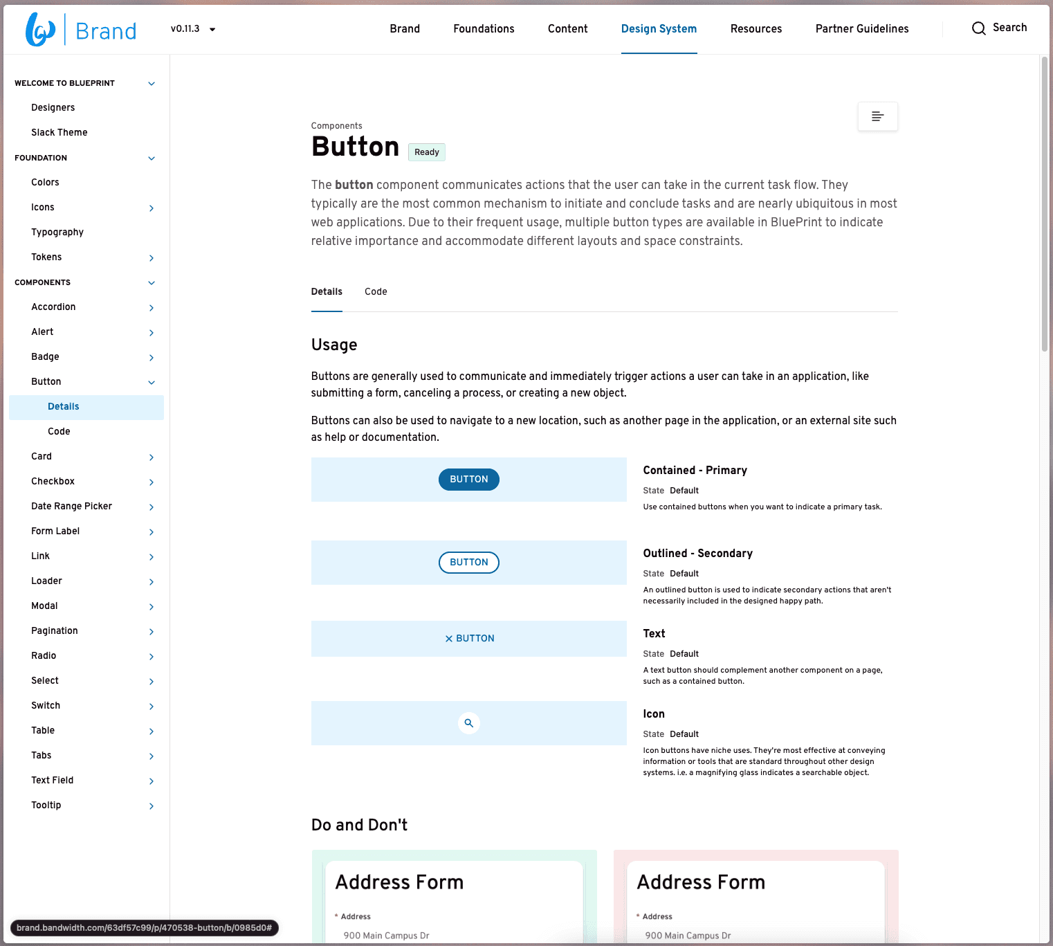
Documentation
I created a documentation site to be the single point of truth for designer or developers that have questions or need examples of components and patterns being used.
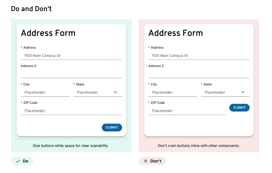
Usage examples
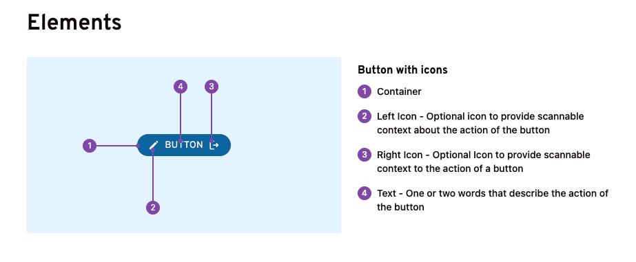
Component elements